

Investor Intros Website Redesign & Lead Funnel Optimization
UX Strategy | Website Design | Conversion Flows | Visual Design | Marketing Support | Cross-Functional Teamwork
Project Status: Ongoing
The Client
Investor Intros
connects accredited investors and investor groups with entrepreneurs seeking capital. Their website plays a critical role in building trust, educating potential clients, and collecting qualified leads through multiple entry points.
The Goal
Present Investor Intros as a credible, professional, and trustworthy brand
Clearly guide founders and investors into the correct onboarding flow
Improve survey completion rates by simplifying and clarifying entry points
Organize inbound leads for internal teams
My Role
Digital Experience Designer
I partnered closely with the founders to redesign and optimize the website in phases, balancing tight marketing deadlines with longer-term redesign goals for their WordPress + Elementor site.
My Scope of Work
UX strategy & information architecture
Content restructuring and messaging
Conversion flow design
Website design updates (UI + layout)
Lead capture and organization setup
Landing page creation for marketing initiatives
This project reflects a fast-paced, early-stage environment where I wore many hats.
Throughout this case study, you will see examples where I own the full user journey from first impression to conversion.
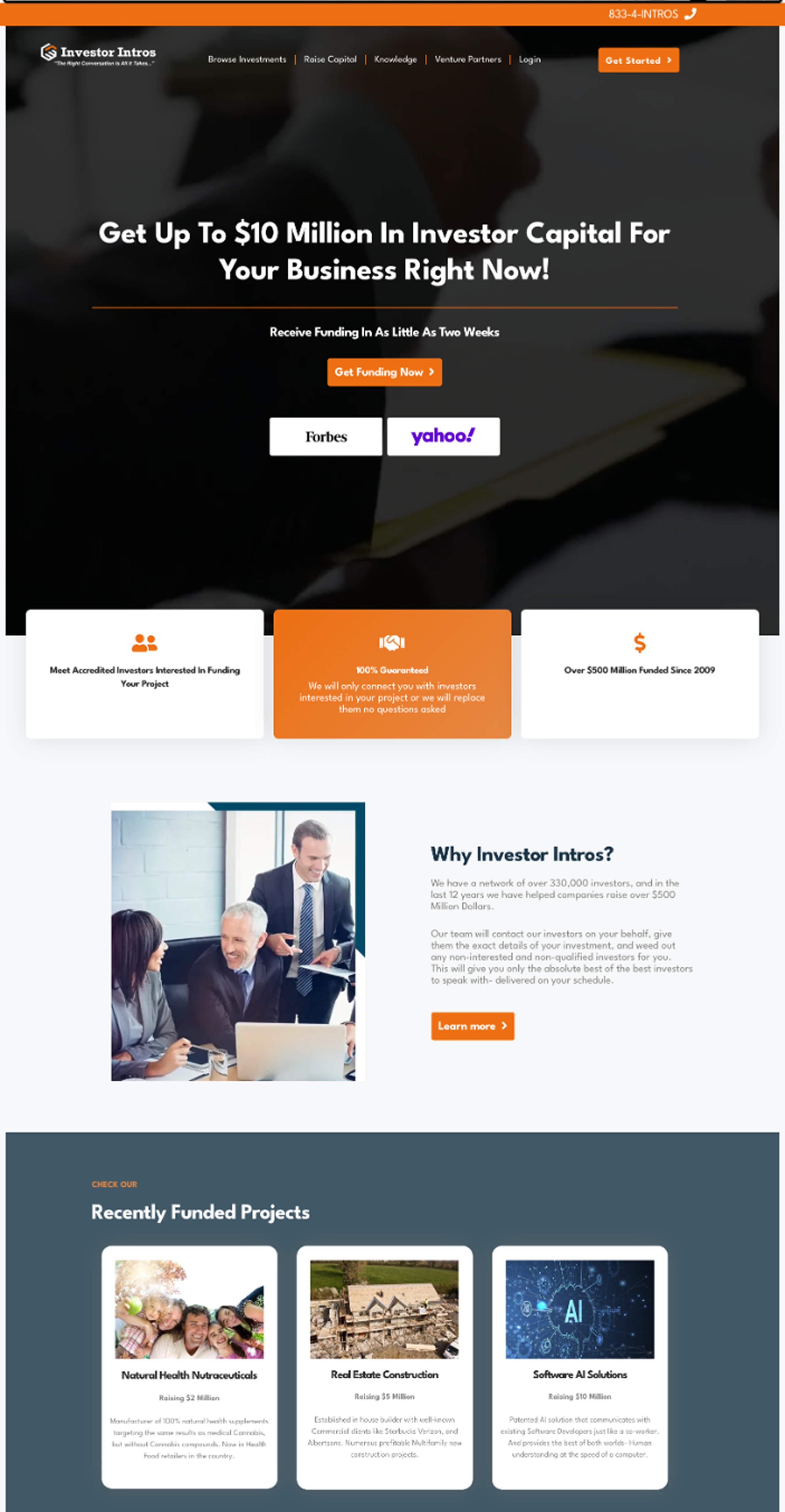
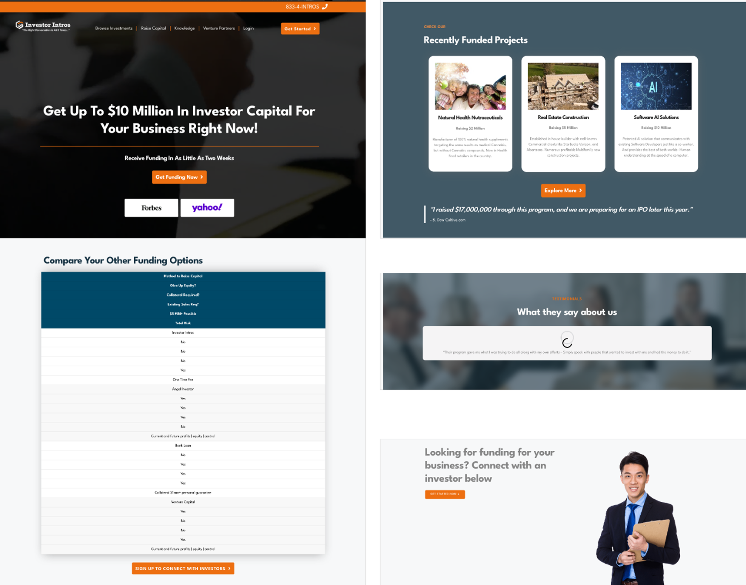
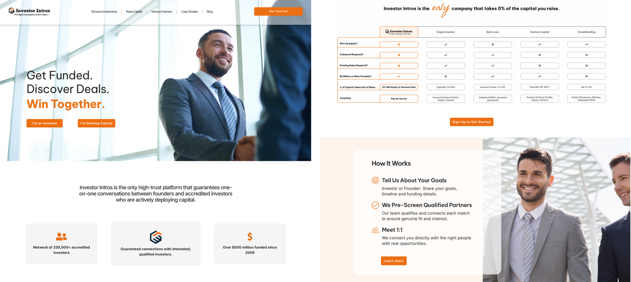
Before
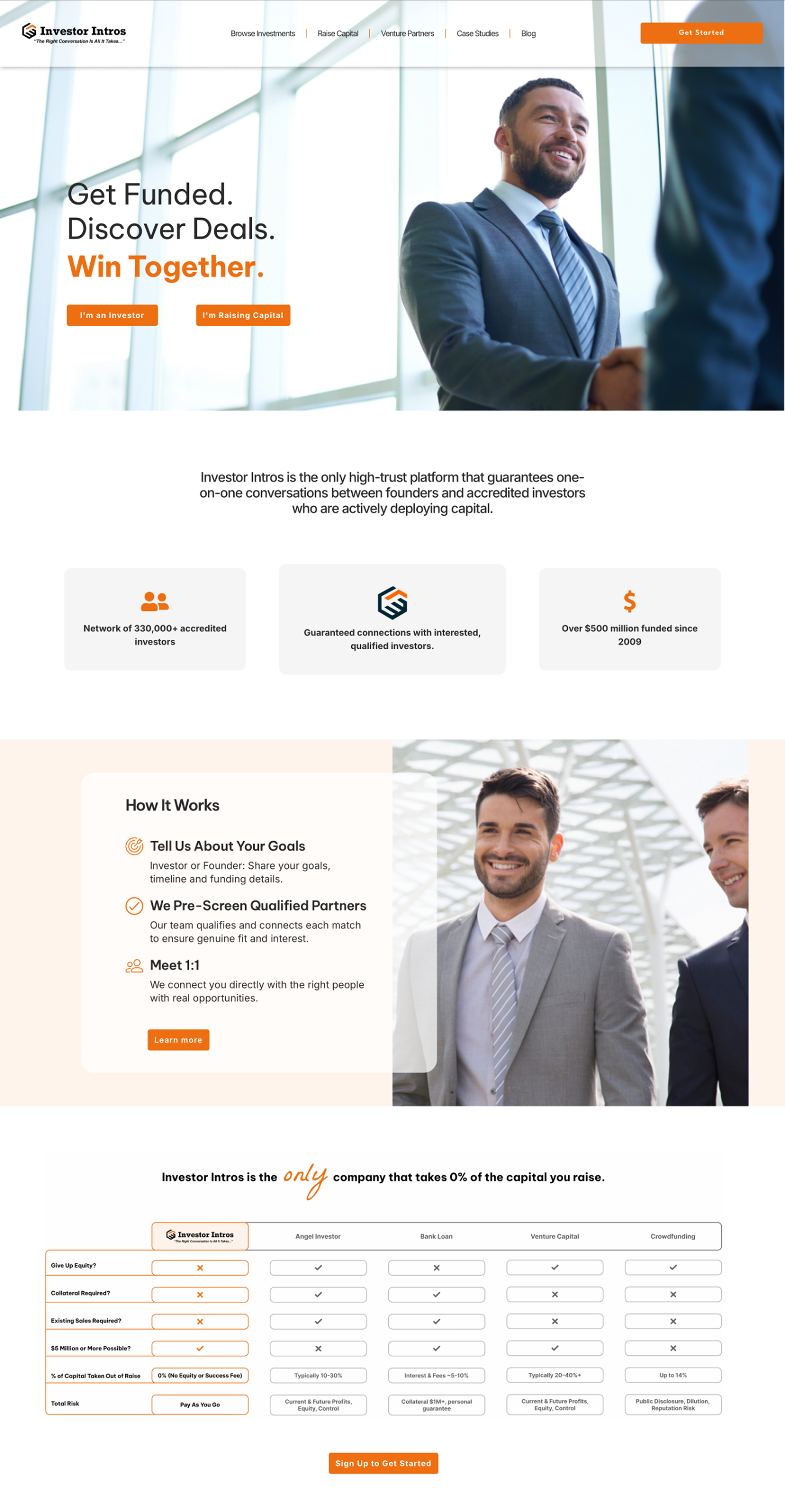
After
Now, Let’s start at the beginning…
Investor Intros has two distinct but equally important user profiles:
Founders
These are entrepreneurs who want to begin raising capital for their business. They come from every industry, and want to raise anywhere between $500,000 and $10M.
+
Investors
These could be angel investors, investor groups, or venture capital companies who want to be introduced to growing companies that match their interests and goals.
They have different goals, but at a high level, we want them to:
Learn about who Investor Intros is, how it works, and why they are different than other fundraising companies.
See examples of recent successes.
Fill out a survey to begin the process of being matched.
But here’s
The Problem
Slow page load times due to excessive animation
Dark, outdated visual design that didn’t reflect the brand’s desired identity
Inconsistent typography and formatting
Confusing navigation and information hierarchy
No clear or consistent sales funnel
Only one primary CTA, which served only half of the target audience
Broken links and buttons
Overall lack of professionalism and trust signals
Contraints
Like any project, there were challenges that would need to be worked around along the way.
Rapidly changing product direction
Limited brand assets
Inherited Elementor template limitations
Multiple urgent updates before events/webinars
No information from previous designer
Research & Inspiration
With no formal research budget, I conducted competitive and comparative analysis, reviewing sites the client admired and direct industry leaders, including Fidelity, Merrill Lynch, and Equifax.
I analysed:
How trust is established visually and through content
CTA placement and messaging
Lead capture patterns and flows
Use of tone and hierarchy to guide different user types
Ideate
I explored ways to:
Reorganize homepage content
Reduce clutter
Present the two pathways clearly
Improve spacing & hierarchy
Bring consistency to typography and colors
Introduce helpful UI components (cards, CTAs, clear sections)
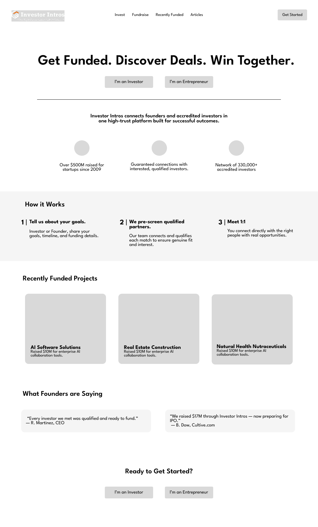
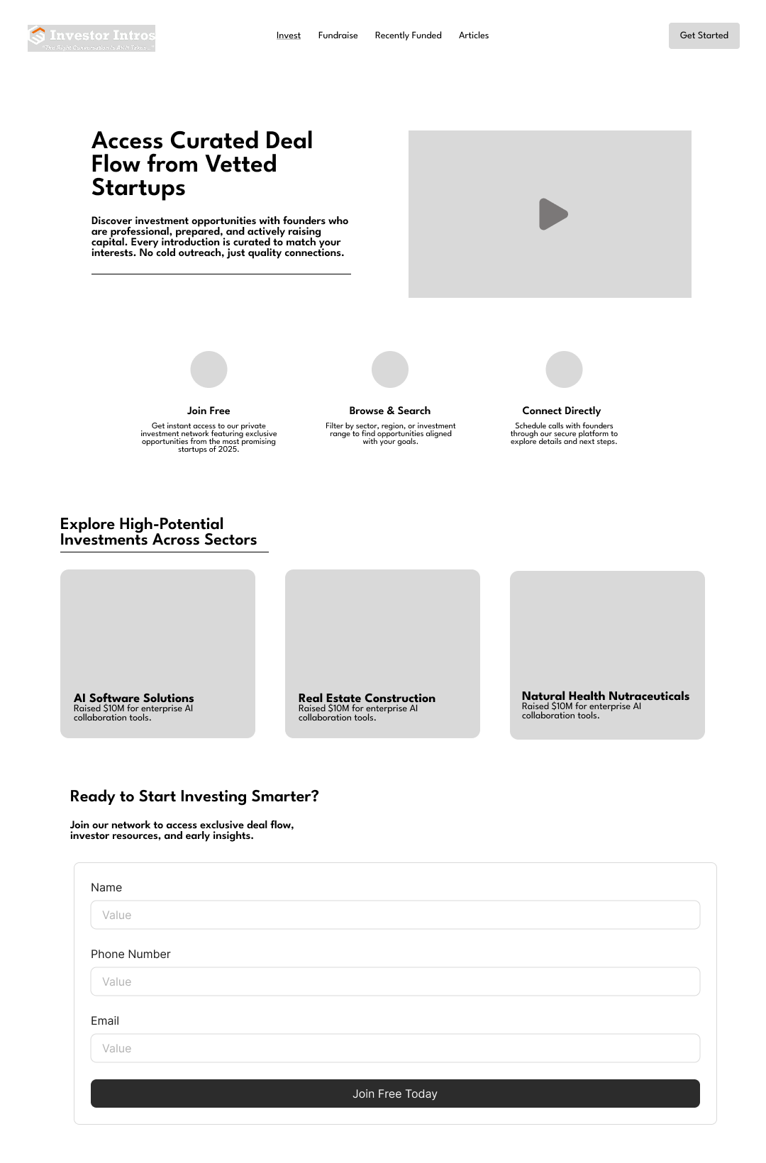
Design
Here you can see some of the solutions and visual assets I created so far.
Additional Contribution
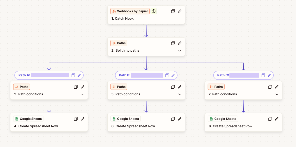
Automation & Lead Capture
What I Built
Zapier automations for both surveys
Routing based on page source + audience type
Organized Google Sheets CRM-style tracking
Added timestamps, URLs, and partner attribution
Why It Mattered
The company was beginning to try new methods of outreach, and needed to be able to better organize and track leads.
Now they have clean, reliable insight into who is submitting what and where they came from.
Results
Clearer User Journey
Visitors immediately understand the service and which path to choose.
Improved conversion readiness
Surveys are now visible, functional, and connected to automated workflows.
Increased Trust & Professionalism
No more broken links, mismatched fonts, or chaotic layouts.
Scalable Foundation
The updated structure supports future pages, services, and product launches.